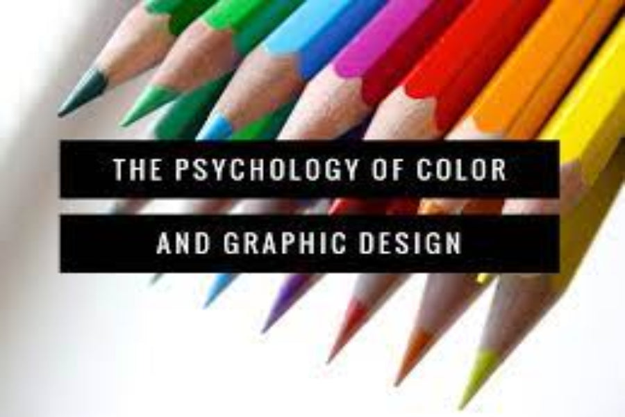
When it comes to stationery design, color plays a crucial role in creating an emotional connection with the user. Colors can evoke different emotions and feelings, and using the right colors can make a big difference in how people perceive and interact with your stationery. In this article, we will explore the science of color psychology in stationery design and how it can impact user behaviour and engagement.
Color Associations
Colors have different associations and meanings depending on culture, context, and personal experiences. For example, red is commonly associated with love, passion, and energy in Western cultures, while in Asian cultures, red is associated with good luck and happiness. Yellow is associated with happiness and sunshine in most cultures, while green is associated with nature, growth, and harmony.
These associations can be used to create a specific mood or emotion in stationery design. For example, using green in a notebook for nature enthusiasts can create a sense of calm and tranquillity, while using red in a journal for goal setting can evoke feelings of energy and motivation.
Goldfish Colors, Pencils and Pens Price in Pakistan
Color Combinations
The way colors are combined can also impact the emotional response they evoke. Complementary colors, which are opposite each other on the color wheel, create a sense of balance and harmony. Analogous colors, which are next to each other on the color wheel, create a sense of unity and cohesion. Triadic colors, which are evenly spaced on the color wheel, create a sense of vibrancy and energy.
Using different color combinations in stationery design can create different moods and emotions. For example, using complementary colors like blue and orange in a planner can create a sense of balance and focus, while using analogous colors like green and yellow in a journal can create a sense of unity and calmness.
Affordable Crayon Colors Price in Pakistan
Color Contrast
Contrast is an important aspect of color psychology in stationery design. Contrast refers to the difference between light and dark, or between colors. High contrast creates a sense of drama and excitement, while low contrast creates a sense of subtlety and harmony.
Using contrast in stationery design can help draw attention to specific elements, such as important dates or notes. For example, using a bright red color for important dates in a planner can help them stand out and be easily noticed.
Color Intensity
The intensity of a color can also impacts the emotional response it evokes. Bright and intense colors can create a sense of excitement and energy, while muted and pastel colors can create a sense of calm and relaxation.
Using different color intensities in stationery design can help create different moods and emotions. For example, using bright and intense colors in a notebook for brainstorming can help stimulate creativity and energy, while using muted and pastel colors in a journal for reflection can create a sense of tranquillity and calmness.
Elevate Your Art with the Best Watercolor Pads
Color Context
Color psychology in stationery design is not just about the individual colors themselves, but also about how they are used in context. The same color can have different meanings and associations depending on the surrounding colors and design elements.
Using color in context in stationery design can help create a cohesive and harmonious design. For example, using shades of blue in a planner for a travel theme can create a sense of calmness and tranquillity, while using shades of green in a notebook for a gardening theme can create a sense of growth and harmony.
Conclusion:
Color psychology is a powerful tool in stationery design that can impact user behaviour and engagement. By understanding the emotional associations and meanings of colors, designers can create stationery that evokes specific moods and emotions.
Using different color combinations, contrasts, intensities, and contexts can help create a cohesive and harmonious design that resonates with users. By incorporating color psychology into stationery design, designers can create stationery that not only looks beautiful but also connects with users on a deeper emotional.
Discover Your Creative Side with Stationers.pk: Your One-Stop Shop for Art Supplies

